Google has recently decided to roll out a new look, some changes most users will take notice of immediately such as Favicons. However, other changes may go undetected at first such as the new paid ad format. Here are some of the changes you can expect.
Google Ads
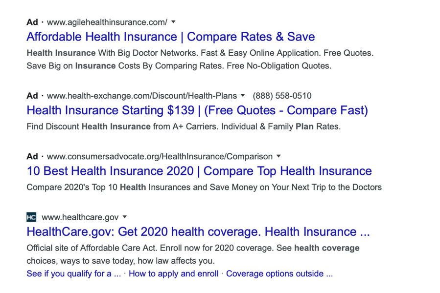
The search engine results have now become a little bit tricky for the average user. Previously the ads were very clearly posted and easy to separate from your search results. Now the ads are in a format and layout very similar to your search results. There is little difference between the two except that the ads have small black writing next to the title that says “ad”. There is no longer the color separation between ads and organic search results. Users can now find the ad URL just below the title.
It is believed this change could have been made to increase ad revenue and per click rates. Initially it appears that you see more ad results than organic search results on these new updates.
Favicons
Google has now added Favicons to the organic search results. Next to each web page generated in your search, you will see each website and their icon next to the site name. Google has mentioned they made these changes in order to try to create a similar look between desktop and mobile options. They also expect the use of Favicons will help users to easily decipher which website they are clicking on, limiting the accidental ad clicks. They require website owners to use Favicons that specifically meet Google’s guidelines. The URL’s are to be stable and are not to be changed frequently. They will also require that the favicon be appropriate, not allowing any offensive imagery to be used.
Product Listings
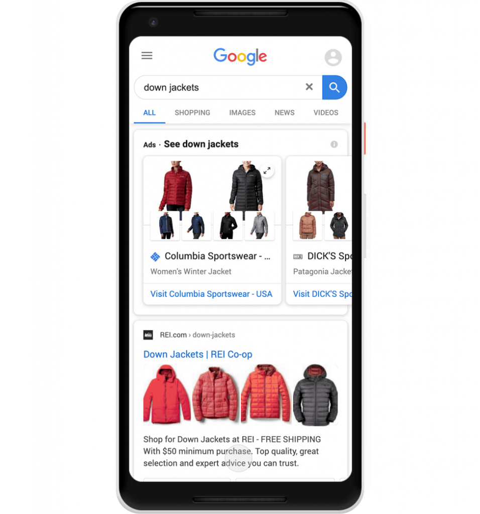
In order to create a much easier product search experience for mobile users, Google has now made changes that group together popular product results in one area. This allows the users to filter through the results and narrow down quickly to the products they are looking for.
As Google continues to lead the industry, you can expect that this will be one of many updates. The overall feel of the newest update seems mixed amongst users, some love it while others hate it! After hearing the feedback from various companies and users, it has been acknowledged that users are finding this new look confusing, while web developers have responded positively to the new changes.
Google took to social media to say that they will be revisiting the new look. Specifically, they are going to review where the Favicons are appearing on the search results. While they conduct their review of the new design, users may or may not see Favicons on all sites.
Google still remains the most used search engine on the planet, however this new look may create distrust with users as it appears to be an intentional move to make the ads less readable within the search results.


